

Smokin Moose
Fallen Cannabis Warrior & Ex Moderator
I came on this and hope someone may find it helpful.
A member asked me for more detailed information on how to do this along with a very challenging photograph, so i wrote him a walkthrough. when i was done i thought, goddamn ben, thats a great walkthrough. so im going to copy and paste it here. keep in mind i wrote this in one go after a nice joint. it's for all three tools photoshop has for colour balancing. i dont know about other image editing software, but i bet any software that has any colour balancing options other than "auto" will have something that closely resembles at least one of these. if you dont have photoshop there is no excuse, a four year old can download and crack it in about thirty seconds (seriously...you click two buttons, a number is generated, you put that number in a photoshop CS2 key crack program, you're done). when i have time i guess ill add screenshots of the things that arent really super clear in words to make it even more cooler.
these are instructions for someone who CANNOT whitebalance at all on their camera. if at all possible, use manual white balance or tungsten white balance under HPS. as you'll see at the end of this thread, photos taken under HPS with no white balancing options on the hardware end can only be fixed so much.
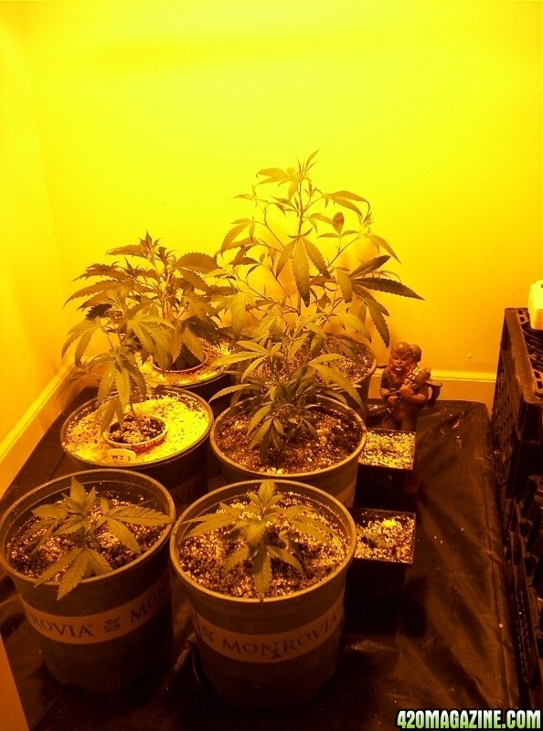
what we start with:
(skip down to the bolded parts if you just want just instructions for how to git 'er dun without needing to fully comprehend what exactly you're doing)
okay, first thing you do after opening the image is image -> adjustments -> levels. RGB should be selected from the dropdown menu, so underneath yo uwill see the overall colour balance histogram. you want this histogram to be as flat as possible, basically. you do not want sharp spikes and valleys, and you want them to be as short as possible. you can go back to this histogram after every adjustment you make to see how much it helped, or if there is something in the photo that should be pure white in the actual photo you can use that to determine visually if the white has gotten purer or not (you will be able to tell easily when a certain colour is oversaturated, it is a little harder to eyeball when only one colour is undersaturated and colour theory helps there). you'll noticed the histogram starts to look weird as you digitally alter the colours, parts turn into vertical lines. you still want to get the vertical lines (that used to be solid sections of histogram) as short and even as possible, but they will usually alternate tall, short, tall, short etc and you need to kind of mentally average them out to see where it falls. does that even make sense? i sure hope so, because you will never get those tall lines to disappear.
we see with this photo that it the values in the middle are very low and very even, and the values at the end are pretty much maxed out. its going to be difficult or impossible to get really good white balance but it can be much better. problem is that HPS gives off so little blue light that there just isnt anything there to augment. so all you can do is lower the red.
we already know that under HPS there is far too much red and yellow light so you dont even need to learn colour theory to know what the graphs mean.
there are a few ways to do this, you can combine them if yo uwant. curves tool, levels tool, and colour adjustment can all do essentally the same thing (you learn the differences as you get used to em) but iwth different interfaces
image -> adjustments -> colour balance is the ieasiest to start with. the best thing you can do for this photo is to lower the red by a full 100%. you can raise blue but there is so little blue in the photo that it really just darkens the photo. colour balance is automatically set for midtones. when you have a good feel for it you can mess around with the colour balance of your shadows and highlights. heres a hint thatll start you off quicker though. this lighting as crazy unbalanced as HPS taken with a camera with no WB settings, you can raise the blue of the highlights to get a better result. the highlights are the most saturated points on hte photo, and they do have just enough blue for it to make a difference instead of just darkening
in fact because your camera has no WB options and there is so little blue in that photo, this is the one way i got the best result out of your photo, over the other two methods that otherwise are a bit more flexible.
image -> adjustments -> curves brings you to a graph of a parabola (well its just a straight line when yo ustart, it becomes a parabola). your input and output for RGB should start at 255 for both (the max setting for curves and levels tools). you can then go into red, green, and blue individually and lower the outputs, here all you can really do is lower the red output, i found the best was around 180 or 190. does the same thing as colour balance and levels tool except that it mathematically BENDS the colours towards what you have input so for super fine tuning its the best.
image -> levels itself can be used pretty much the same way as with the c urves, by setting the inputs and outputs. you can also "clip" with this tool. you can "clip" colours so that above a certain brightness and below a certain darkness they are rendered simply as black and white. the white slider obviously is for light values, the black one is for the dark values. the further in from their edges you move them, the more colour detail loses range. you can used those more in-depth options to your advantage with hps lighting by moving the red slider from the left (dark) side a little bit and moving the blue from the left side. you'll notice that there is so little blue in this photograph that the histogram for the blue goes less than halfway across the range of values. by moving the slider for the brightest values in towards the middle you are stretching the blue more evenly through all values from black to white in the photograph. you will notice that it does the same thing to this histogram as i mentioned at the beginning about the overall levels histogram, turning to lines. this is a result of how the program digitally re-arranges the colour you just fucked with (it cannot create colour that isnt there in the photo).
the ultimate limitation to augmenting blue in a photo in which there is just not enough blue is that you can only change it so much before spots that should be white become glowing blue like someone went in with microsoft paint and coloured in pixels
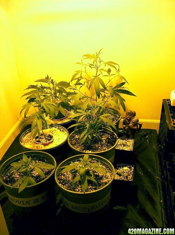
after using the image -> adjustments -> colour balance tool to lower the red 100% and lower the red a little more and raise the blue a good 30% for HIGHLIGHTS, this is the best i could do:
hope that helps, happy growing,
-ben
A member asked me for more detailed information on how to do this along with a very challenging photograph, so i wrote him a walkthrough. when i was done i thought, goddamn ben, thats a great walkthrough. so im going to copy and paste it here. keep in mind i wrote this in one go after a nice joint. it's for all three tools photoshop has for colour balancing. i dont know about other image editing software, but i bet any software that has any colour balancing options other than "auto" will have something that closely resembles at least one of these. if you dont have photoshop there is no excuse, a four year old can download and crack it in about thirty seconds (seriously...you click two buttons, a number is generated, you put that number in a photoshop CS2 key crack program, you're done). when i have time i guess ill add screenshots of the things that arent really super clear in words to make it even more cooler.
these are instructions for someone who CANNOT whitebalance at all on their camera. if at all possible, use manual white balance or tungsten white balance under HPS. as you'll see at the end of this thread, photos taken under HPS with no white balancing options on the hardware end can only be fixed so much.
what we start with:
(skip down to the bolded parts if you just want just instructions for how to git 'er dun without needing to fully comprehend what exactly you're doing)
okay, first thing you do after opening the image is image -> adjustments -> levels. RGB should be selected from the dropdown menu, so underneath yo uwill see the overall colour balance histogram. you want this histogram to be as flat as possible, basically. you do not want sharp spikes and valleys, and you want them to be as short as possible. you can go back to this histogram after every adjustment you make to see how much it helped, or if there is something in the photo that should be pure white in the actual photo you can use that to determine visually if the white has gotten purer or not (you will be able to tell easily when a certain colour is oversaturated, it is a little harder to eyeball when only one colour is undersaturated and colour theory helps there). you'll noticed the histogram starts to look weird as you digitally alter the colours, parts turn into vertical lines. you still want to get the vertical lines (that used to be solid sections of histogram) as short and even as possible, but they will usually alternate tall, short, tall, short etc and you need to kind of mentally average them out to see where it falls. does that even make sense? i sure hope so, because you will never get those tall lines to disappear.
we see with this photo that it the values in the middle are very low and very even, and the values at the end are pretty much maxed out. its going to be difficult or impossible to get really good white balance but it can be much better. problem is that HPS gives off so little blue light that there just isnt anything there to augment. so all you can do is lower the red.
we already know that under HPS there is far too much red and yellow light so you dont even need to learn colour theory to know what the graphs mean.
there are a few ways to do this, you can combine them if yo uwant. curves tool, levels tool, and colour adjustment can all do essentally the same thing (you learn the differences as you get used to em) but iwth different interfaces
image -> adjustments -> colour balance is the ieasiest to start with. the best thing you can do for this photo is to lower the red by a full 100%. you can raise blue but there is so little blue in the photo that it really just darkens the photo. colour balance is automatically set for midtones. when you have a good feel for it you can mess around with the colour balance of your shadows and highlights. heres a hint thatll start you off quicker though. this lighting as crazy unbalanced as HPS taken with a camera with no WB settings, you can raise the blue of the highlights to get a better result. the highlights are the most saturated points on hte photo, and they do have just enough blue for it to make a difference instead of just darkening
in fact because your camera has no WB options and there is so little blue in that photo, this is the one way i got the best result out of your photo, over the other two methods that otherwise are a bit more flexible.
image -> adjustments -> curves brings you to a graph of a parabola (well its just a straight line when yo ustart, it becomes a parabola). your input and output for RGB should start at 255 for both (the max setting for curves and levels tools). you can then go into red, green, and blue individually and lower the outputs, here all you can really do is lower the red output, i found the best was around 180 or 190. does the same thing as colour balance and levels tool except that it mathematically BENDS the colours towards what you have input so for super fine tuning its the best.
image -> levels itself can be used pretty much the same way as with the c urves, by setting the inputs and outputs. you can also "clip" with this tool. you can "clip" colours so that above a certain brightness and below a certain darkness they are rendered simply as black and white. the white slider obviously is for light values, the black one is for the dark values. the further in from their edges you move them, the more colour detail loses range. you can used those more in-depth options to your advantage with hps lighting by moving the red slider from the left (dark) side a little bit and moving the blue from the left side. you'll notice that there is so little blue in this photograph that the histogram for the blue goes less than halfway across the range of values. by moving the slider for the brightest values in towards the middle you are stretching the blue more evenly through all values from black to white in the photograph. you will notice that it does the same thing to this histogram as i mentioned at the beginning about the overall levels histogram, turning to lines. this is a result of how the program digitally re-arranges the colour you just fucked with (it cannot create colour that isnt there in the photo).
the ultimate limitation to augmenting blue in a photo in which there is just not enough blue is that you can only change it so much before spots that should be white become glowing blue like someone went in with microsoft paint and coloured in pixels
after using the image -> adjustments -> colour balance tool to lower the red 100% and lower the red a little more and raise the blue a good 30% for HIGHLIGHTS, this is the best i could do:
hope that helps, happy growing,
-ben