

Truth Seeker
New Member
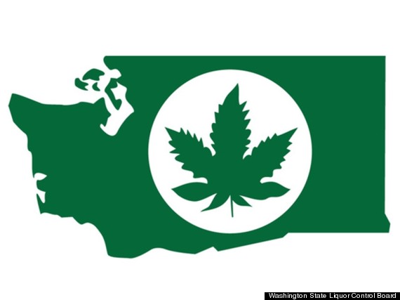
A proposed logo for marijuana products in Washington state appears to have been too obvious, in hindsight.
Last week, regulators in the state scrapped the logo, which would have appeared on packaging for all recreational cannabis products, in response to pressure from critics who said the design (pictured below) glamorized marijuana culture.
Washington legalized pot last year, empowering the state's Liquor Control Board to write rules that will govern retail cannabis sales. As part of the process, an in-house designer came up with the logo that, by law, must mark all products that include cannabis as an ingredient.
"The intention behind it, of course, was to readily identify marijuana products," Mikhail Carpenter, a spokesperson for the liquor board, told The Huffington Post. "When you're dealing with extracts or brownies, you need to make sure you identify them as containing cannabis."
Regardless of the intention, critics suggested the image of a chunky, asymmetrical pot leaf against an outline of the state of Washington was ill-conceived.
A nonprofit called the Children's Alliance sent regulators a letter last month complaining that the insignia could "reasonably be viewed as branding Washington 'The Marijuana State,' or as Washington proudly promoting marijuana use to the rest of the world."
A local business journal wrote that the logo looked "looks like a decal fit for a Cheech and Chong van," while Mark Kleiman, a UCLA professor who is advising the state on its rule-making process, told an Oregon public radio station that the image did "seem to be closer to endorsement than is probably wise."
"We received criticism that it was a little too promotional, a little too flashy, that it would be appearing in T-shirts -- and that's why it was pulled," said Carpenter, the liquor board spokesperson. The board did not specify when or if a new logo would be ready but said it "reserved the right" to produce another one.
Samuel Holleran, a graphic designer in New York who works in public policy, told HuffPost it should have been obvious to the Washington regulators that the logo was inappropriate.
"The image of the pot leaf itself is so counter cultural, it's almost impossible to present it as a non-biased government symbol," Holleran said, explaining that graphic design related to public health and safety has historically been sober and meant to inspire trust in the authorities.
While the Liquor Control Board might have thought it logical to put a drawing of the cannabis plant on cannabis products, "that sort of canon elevation doesn't really work," Holleran said.
"The ATF doesn't put an image of a can of beer, an AK-47 and rolling papers on the licenses it grants," he added. "It's not always logical to show what you do as your graphic identity."
News Hawk- Truth Seeker 420 MAGAZINE ®
Source: huffingtonpost.com
Author: Eleazar David Melendez
Contact: Contact us
Website: Washington State's Marijuana Logo Nixed As Too Weed-Friendly