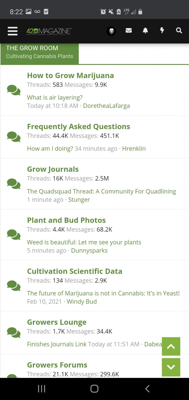
It seems clunky. I've been here for a few years and find myself spending a long time looking for the right categories.
Example if your on mobile and click
"THE GROW ROOM "
This is what u get

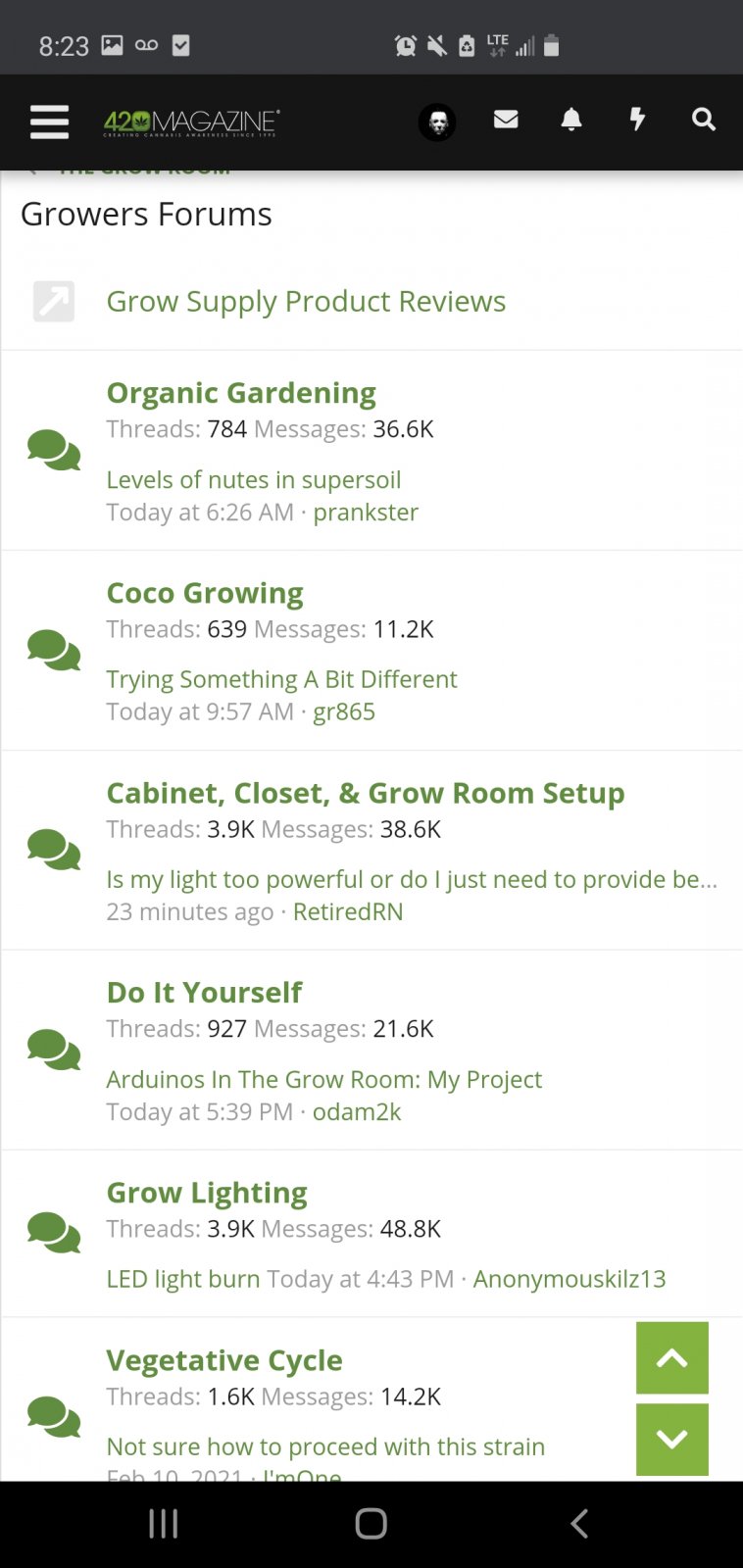
Then you have to actually go and click on
"GROWERS FORUMS"
Which finally brings you to the area you actually want to be in.

There's some other minor issues with the categories but this is my main one.
Not a huge deal I just thing it could be a little more fluid.
I dont think plant and bud photos should see on the first page of grow room.
More like veg cycle. Flower cycle. Lighting. Thats what newbies are looking for when they need help about growing.
Maybe I'm OCD. Maybe I'm just too baked.
I just thought I'd mention it
Example if your on mobile and click
"THE GROW ROOM "
This is what u get
Then you have to actually go and click on
"GROWERS FORUMS"
Which finally brings you to the area you actually want to be in.
There's some other minor issues with the categories but this is my main one.
Not a huge deal I just thing it could be a little more fluid.
I dont think plant and bud photos should see on the first page of grow room.
More like veg cycle. Flower cycle. Lighting. Thats what newbies are looking for when they need help about growing.
Maybe I'm OCD. Maybe I'm just too baked.
I just thought I'd mention it


 . Everything message board can have a better layout.