

Navigation
Install the app
How to install the app on iOS
How To Use Progressive Web App aka PWA On 420 Magazine Forum
Note: This feature may not be available in some browsers.
More options
You are using an out of date browser. It may not display this or other websites correctly.
You should upgrade or use an alternative browser.
You should upgrade or use an alternative browser.
420 Magazine Logo Contest
- Thread starter 420
- Start date
- Thread starter
- #242
420
Founder
Those will come when we build the store, maybe by June or July. 
Is that when you're going to sell those 420 Bud jars too?!
Truth Seeker
New Member
YAY!  new site time... were getting closer

new site time... were getting closer trigger-420
New Member
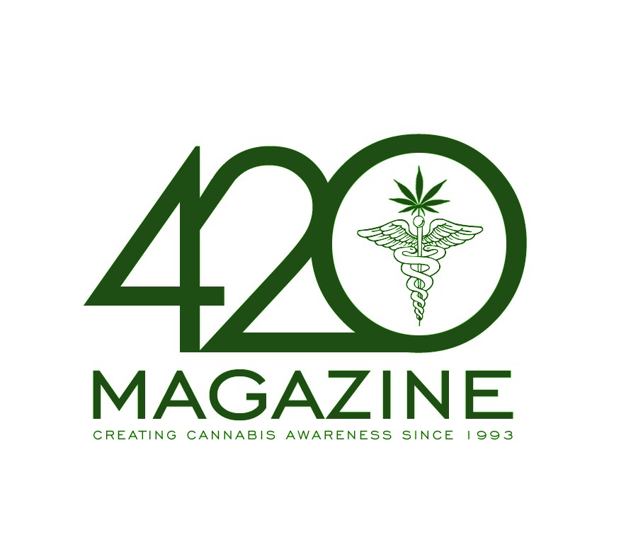
Here is your new logo your looking for. The story of the logo is this:
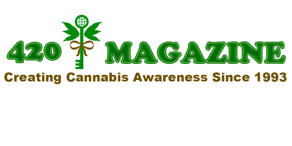

The key in the logo design represents of course "The key to cannabis awareness is the global unity of everyone". Which is represented by the globe in the key eye. instead of wings, we have the cannabis leaf that takes the place of the wings in the medical staff. This also pays tribute to the medical purposes and uses of cannabis. The promise ribbon is 420 Magazine's promise to continue is fight to bring global cannabis awareness to everyone. As a whole, it takes on the role of 420 Magazines very own symbol of awareness.
I have enclosed embedded two variations of the logo. Both are set at a resolution of 300 and ready for print. please pm me if you have any questions or comments.
Nicely done, and good symbol explanation! Although, the "Wings" of the "Medical Staff" are not immediately apparent when looking at the symbol, The Key, World, and Promise are.
trigger-420
New Member
Nicely done, and good symbol explanation! Although, the "Wings" of the "Medical Staff" are not immediately apparent when looking at the symbol, The Key, World, and Promise are.
Apparent in meaning? or that they are actually cannabis leafs? I can tighten the leafs up a bit so that they are more obvious. thanks for the feedback.
PS to everyone. i know this is a contest, butcha gotta be confident ehheeeheh. gl to everyone who has submitted their design and ideas.
trigger-420
New Member
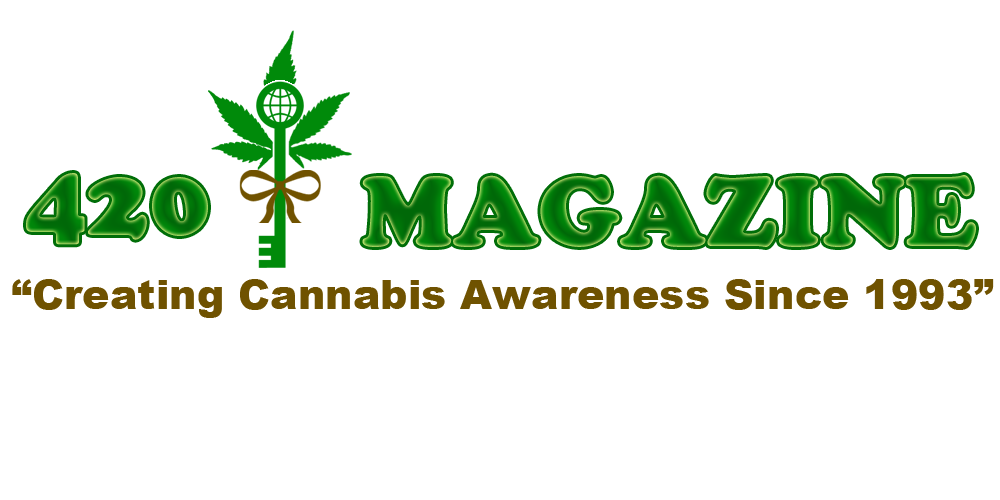
here is an alternative based off the feedback i have so far. I just basically opened the leafs back up and surrounded the key with it. what do you think?
trigger-420
New Member
Hopefully I am not offending anyone, I just think that sometimes the places the logos is going to go is not considered and it really is the most important. Something that looks wonderful in one place may not be legible in another and the logo for 420 needs to work in multiple places and should be legible and have just as much impact in every one of those places. IE, Web, letterhead, business cards and magazine cover.
very well said. i agree. must be easy on the eyes as well. too flashy and it tends to confuse. gotta be easily imprinted in the mind so that it can be remembered when seen again. At some point in time you should be able to just look at the symbols and know that its 420 Magazine. nice work by the way. i thoroughly enjoyed looking at all your ideas.
Apparent in meaning? or that they are actually cannabis leafs? I can tighten the leafs up a bit so that they are more obvious. thanks for the feedback.
PS to everyone. i know this is a contest, butcha gotta be confident ehheeeheh. gl to everyone who has submitted their design and ideas.
No, not apparent meaning, I mean that the Caduceus is sort of lost behind the key. There are no snakes to suggest it either, so the leaves aren't seen as the wings, but as decoration for the key itself. That may be just me, but I didn't even see the Caduceus as being present.
And while we're on the subject... The Caduceus (Staff of Hermes and symbol of Commerce and Negotiation) is mistakenly used as a symbol of medicine and/or medical practice, especially in North America, because of widespread confusion with the traditional medical symbol, the Rod of Asclepius, which has only a single snake and no wings.

Sorry, it's been bugging, me. I tried not to make waves here, and even included it in my submissions to avoid this, but I can't take it anymore.
I feel like we want to be careful with medical marijuana being pushed via 420mag. While I whole-heartedly support it, and am I patient myself. IMO the goal is recreational acceptance more so than medical. I understand medical is the first step, sometimes I just worry we'll get too content with solely medical marijuana and the powers that be will meet in the middle.
I feel this great plant deserves to hit all peoples lives, medical or not. It enhances your life, thinking, and understanding. Those with medical needs obviously should benefit from it, however there's plenty to go around (would be even more so, once our laws stop trying to dictate peoples morals).
I feel this great plant deserves to hit all peoples lives, medical or not. It enhances your life, thinking, and understanding. Those with medical needs obviously should benefit from it, however there's plenty to go around (would be even more so, once our laws stop trying to dictate peoples morals).
Truth Seeker
New Member
I'm still stuck on #5 as well and am leaning towards going with it. The new website is in full swing and our projected launch date is 4/20/2012. We plan to unveil the winner in the new design and will make the official announcement at that time.

maybe this will help stop the waves... I think that 420 has came to the decision of choices... I know that he narrowed it down to 5 that he felt was the best... I don't know for sure though... hopefully if he gets a moment, he can chime in here.
IMO, no offense to trigger, but it looks to cartoonish to me... again I mean no offense. just how I feel when I see it. Great job though


Ganjahoarder
New Member
I don't like it. There needs to be a medical badge on it somewhere. Med MJ is a big deal and would add significance credibility for our beloved plant. If you don't put a medical badge on your logo, you defy any representative of MMJ.
- Thread starter
- #253
420
Founder
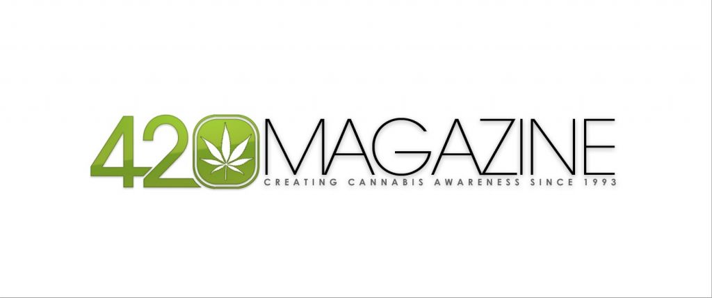
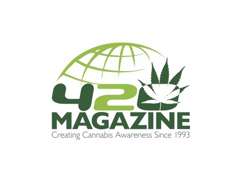
I'm down to these 4, what are your thoughts?
Truth Seeker
New Member
I'm down to these 3, what are your thoughts?
420% my choice by far
I love the look of this one and I feel it would look great on top
budbro
New Member
I'm down to these 3, what are your thoughts?
This one is my fav too!
- Thread starter
- #256
420
Founder
Polls are open, please let the voting begin. 
Thanks to everyone who submitted all of these amazing logos, we are truly grateful.
We love them all, however can only use one.
Thanks to everyone who submitted all of these amazing logos, we are truly grateful.
We love them all, however can only use one.
Ganjahoarder
New Member
I like the third one. Gives it legitimacy and is professional looking.
trigger-420
New Member
I like the third one. Gives it legitimacy and is professional looking.
agreed. i like the third one. looks really good and very professional.
trigger-420
New Member
maybe this will help stop the waves... I think that 420 has came to the decision of choices... I know that he narrowed it down to 5 that he felt was the best... I don't know for sure though... hopefully if he gets a moment, he can chime in here.
IMO, no offense to trigger, but it looks to cartoonish to me... again I mean no offense. just how I feel when I see it. Great job though
None taken. I really appreciate the honesty. I think I am going to go walk into on coming traffic now........ cya guys. LMAO JK...
Truth Seeker
New Member
ah ha ahaaha ok I can't laugh at that...
SORRY BROTHA COME BACK... LOL
SORRY BROTHA COME BACK... LOL