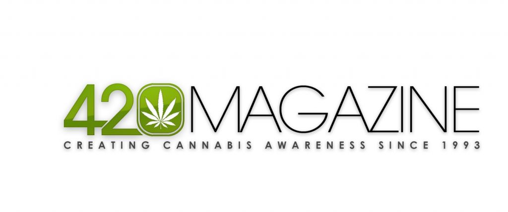
420 Magazine Logo Contest

Vote for the New 420 Magazine Logo

  • Miro #1

    Votes: 12 27.3%
  • Miro #2

    Votes: 9 20.5%
  • Miro #3

    Votes: 23 52.3%

  • Total voters
    44
The leaf is a great symbol for Cannabis in its design. The meaning is still a struggle between medical vs street, we have to change it to just representing the plant itself. Use it for medical or an emblem of the new medical task force could also work. We have the Red Cross and blood bank comes to mind, if we see the Cannabis leaf then relief will come to mind.

In time the meaning change due to the changing minds.
 
My mention of the leaf was articulate and concise. I used the words "Leaf most prominent". This does not mean it shouldnt be there at all. In fact, I voted for #3 as it does have the leaf, but it's prominence is more understated by the med sign and 420magazine.

your right brotha. there in lies the dilemma, how to create a logo that shows both the leaf and the medical badge or staff of hermes if you will. its a tricky one to say the least. I am working on what i feel would keep to our target audience.
 
I personally like the first one's 420 with the leaf, but hate that none of these have the globe incorporated anywhere on any of them! 420 is about repealing cannabis prohibition EVERYWHERE on the planet like the original logo implies.
logo15.jpg
 
What are your thoughts on this one?
7389.jpg


Contest Polls have been reset, please vote for your favorite. :cheer:
:Namaste:

I understand why you would make the tag line larger and I do think it is important it just does not look correct, can't really put my finger on why but #1 just looks more balanced. I guess it just looks like the tag line is not part of the logo. Just an opinion.
 
What are your thoughts on this one?
7389.jpg


Contest Polls have been reset, please vote for your favorite. :cheer:
:Namaste:

:hmmmm: I am failing to see what you see brotha... Totally respect your opinion though. IMO, it looks better balanced with it stretched out under the 420 portion...


:peacetwo:

To tell you the truth I am not exactly sure what is bothering me, it just looks like something is off. Not that it is not an amazing logo, because it is. I think it might be the 420 is longer than the MAGAZINE, which causes more space between MAGAZINE and the tag line than there is between 420 and the tag line. This might be what is throwing me off. Nit Picking I guess but either logo would work just fine and look great. Just thought I would throw in my 2 cents for whatever it is worth.
 
Great point, I had not noticed that. Thanks brother. ;)
To tell you the truth I am not exactly sure what is bothering me, it just looks like something is off. Not that it is not an amazing logo, because it is. I think it might be the 420 is longer than the MAGAZINE, which causes more space between MAGAZINE and the tag line than there is between 420 and the tag line. This might be what is throwing me off. Nit Picking I guess but either logo would work just fine and look great. Just thought I would throw in my 2 cents for whatever it is worth.
 
To tell you the truth I am not exactly sure what is bothering me, it just looks like something is off. Not that it is not an amazing logo, because it is. I think it might be the 420 is longer than the MAGAZINE, which causes more space between MAGAZINE and the tag line than there is between 420 and the tag line. This might be what is throwing me off. Nit Picking I guess but either logo would work just fine and look great. Just thought I would throw in my 2 cents for whatever it is worth.

Oh, I see it. That's what it is I think... the "MAGAZINE" needs to increase font size by 3pt. maybe 5pt.? As it is now, it gives uneven vertical spacing from the top of the tag line to the bottom of "420" vs. that of the space between the tagline and "MAGAZINE".
 
First, Miro's work is beautiful and really well done.

I have one question though, and I realize this input is late but it didn't hit me until now... Is there any way to make the "0" in 420 to look more like a zero? I feel like the logo you are talking about (in reference to the space to the tagline) is nearly perfect, and Sonzor's feedback was great too, but the zero looks a little too square or rectangular to me - especially as the "4" and the "2", aren't quite as wide at least to my eye (maybe just a little narrower? I realize the leaf might make that tricky). A little more like a "0"/zero and I think you have a really killer logo.

Just my opinion, and I'm sorry I didn't think of this feedback sooner - the logo is great either way to me. Great work, Miro! :thumb:
 
Oh shoot, I knew the vote had been reset, but i didn't know the pics changed. Sorry, Ima tard for not looking beforehand. I voted for #1 again and I meant to vote for #3 this time. You can change it if it makes a difference or you want too. Miro, you RAWK btw, thanks for helping 420 out, and in turn, us!
 
personally i think it would look a lot better if it wasnt against a white background, if it had a black background the green could be a stronger green and more plant like and the writing could be a different color as well, i think then it would really stand out, ive voted for the one i thinks best but their is only 3 to choose from, would of thought their would be a lot more entries to choose from if i had of know their was a contest for this then i may of entered one myself

i just think the white background is letting it down as it dont really stand out, if it was black background then i think it would grab your attention,

say if the design was chose out of the 3 i think a brilliant idea would be to let people use that design and let them change the colors and style and then submit that as the final entry, but i may be totally wrong here but the white back ground dont really make it stand out, but each to their own. would of liked to see more entries
 
Back
Top Bottom