

Navigation
Install the app
How to install the app on iOS
How To Use Progressive Web App aka PWA On 420 Magazine Forum
Note: This feature may not be available in some browsers.
More options
You are using an out of date browser. It may not display this or other websites correctly.
You should upgrade or use an alternative browser.
You should upgrade or use an alternative browser.
420 Magazine Logo Contest
- Thread starter 420
- Start date
HiTimes4Me
New Member
HiTimes4Me
New Member
HiTimes4Me
New Member
Just thought I'd give it a shot too since everybody's contributing sorry it is kind of small 
HiTimes4Me
New Member
Also I can mix & match any combination that you see above & change colors and what not obviously...but just thought I'd throw that in there
OneLoveAshG
New Member
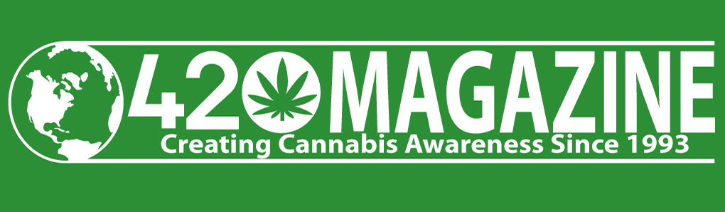
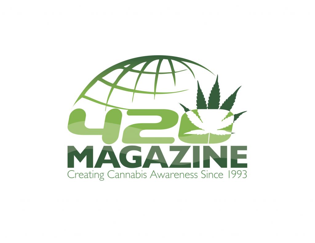
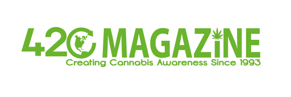
When designing a logo, I learned that the best logos are simple yet elaborate and versatile at the same time. When I designed this one, I kept that in mind. This logo is very simple, reminiscent to the big name brands that mostly use a very clean and easy to read font and a small preview of what their company is about (i.e target and apple) The globe alludes to the slogan "creating cannabis awareness" and the 420 with the cannabis leaf embedded into the zero represents what 420 means. The logo can also be changed into virtually any color, have a border placed around it, and can even have an image in place of color if needed. That makes it extremely versatile for almost any media, may it be stickers, t-shirts, letterheads, web etc.
art fog
New Member
I will end w/ this. I put a little more green. I will tweak it when necessary. Happy New Year everybody.


- Thread starter
- #208
420
Founder
I have seen numerous professional designs that I really like, just can't wrap my head around a winner yet. I apologize to all of you left hanging, sure do wish this was easier. It's not over til it's over however, and I am truly grateful for everyone's patience, support and understanding. 

Degauss
New Member
I just caught up on all of this, and I absolutely loved reading this thread and stimulating my mind for my own projects. I want to thank everyone- and I can see how hard it is to pick!
What a great and fun idea!
Overall I think I am partial to this emailed entry:

I looked at every single entry, and liked this one best overall because it is clean for print, and professional in a young, modern way. However, I think it could be thinned out (like the lines and fonts thickness) and darkened. Then again, while I would want to see that, those changes could ruin it! Whoever did that series (by comparing the font used for 420 in the adjacent emailed entries) had some good ones!
I also liked this one:
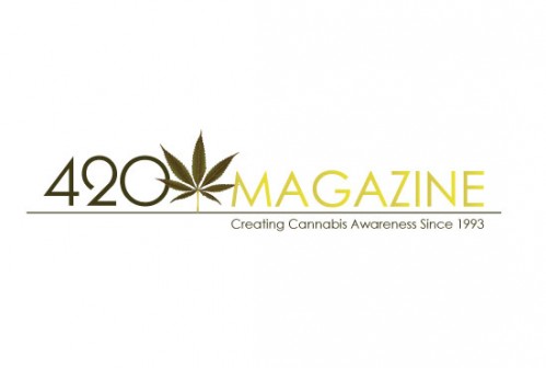
I like how thin and subtle this one is- but didn't like the lack of green and thought the sizing could be evened out. Again, this is clean, modern, and suitable for print. Which brings me to my final favorite by Miro:
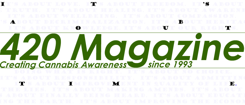
This one is terrific for a light background with a more even feeling horizontal layout. I think the green might look nicer darkened, and the 2-tones could be brought a bit closer together. I love the super duper thin font used for "MAGAZINE"
In my opinion, a good logo can't be too photographic or colorful- for a great example refer to the familiar fedex logo. I wonder what some of the other fedex ideas they had were? Some of the entries look like cool bumper stickers or shirts though...
Best regards and happy and hempy new year to all!
What a great and fun idea!
Overall I think I am partial to this emailed entry:
I looked at every single entry, and liked this one best overall because it is clean for print, and professional in a young, modern way. However, I think it could be thinned out (like the lines and fonts thickness) and darkened. Then again, while I would want to see that, those changes could ruin it! Whoever did that series (by comparing the font used for 420 in the adjacent emailed entries) had some good ones!
I also liked this one:
I like how thin and subtle this one is- but didn't like the lack of green and thought the sizing could be evened out. Again, this is clean, modern, and suitable for print. Which brings me to my final favorite by Miro:
This one is terrific for a light background with a more even feeling horizontal layout. I think the green might look nicer darkened, and the 2-tones could be brought a bit closer together. I love the super duper thin font used for "MAGAZINE"
In my opinion, a good logo can't be too photographic or colorful- for a great example refer to the familiar fedex logo. I wonder what some of the other fedex ideas they had were? Some of the entries look like cool bumper stickers or shirts though...
Best regards and happy and hempy new year to all!
Quick fun fact, have you ever noticed the arrow within the FedEx logo? Something like that would be cool for the 420 mag logo. Another example is Amazon's logo where the line goes from A to Z in the word.
Quick fun fact, have you ever noticed the arrow within the FedEx logo? Something like that would be cool for the 420 mag logo. Another example is Amazon's logo where the line goes from A to Z in the word.
fedexlogo
You might find this logo boring. But if you look at it carefully, you'll be seeing something creative, an idea which is incredibly awesome.
It is one of those great logos out there who uses typography wisely. But unlike many other logos, this one uses hidden symbols. A symbol which is logically perfect for its company purpose, a shipping courier which sends and drops off certain package into its destination.
FedE->X
It's like an arrow pointing to a red 'X' mark of a treasure map. an arrow pointing to its destination.
Incredible isn't it?
- Thread starter
- #212
420
Founder
I would love to see these in action, if at all possible?
Still working on this guys, hope you haven't given up on us yet.
Quick fun fact, have you ever noticed the arrow within the FedEx logo? Something like that would be cool for the 420 mag logo. Another example is Amazon's logo where the line goes from A to Z in the word.
Still working on this guys, hope you haven't given up on us yet.
Played around some more, and got these.
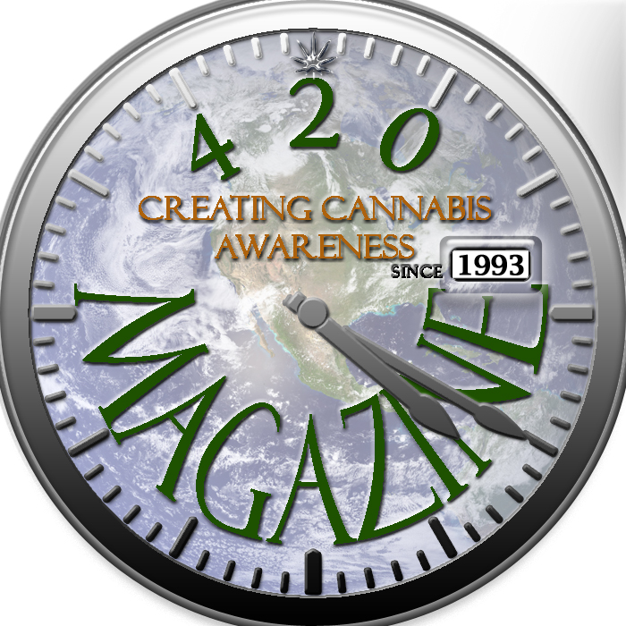
Nice. I like this one so far. Gotta look back further though...
OneLoveAshG
New Member
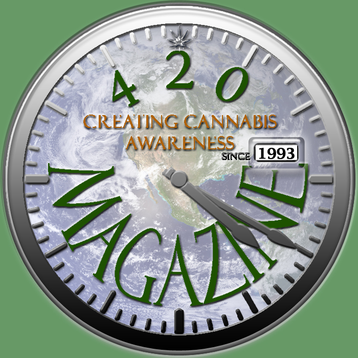
Perhaps something like this?
Sonzor
New Member
Perhaps something like this?
Very nice.. + rep
I concur, and +rep too!

Just goofing around, you can delete it if you like. But it might be interesting to someone so I posted it.
Nebody209
New Member
Perhaps something like this?
i say this one good job to the maker, id pick this magazine up based upon the professional appeal of the logo alone not to mention the attatchment to the earth and oxone trough the "0" in 420