

Hehehe, I really like this one for a 420 Chocolate Bar!
Navigation
Install the app
How to install the app on iOS
How To Use Progressive Web App aka PWA On 420 Magazine Forum
Note: This feature may not be available in some browsers.
More options
You are using an out of date browser. It may not display this or other websites correctly.
You should upgrade or use an alternative browser.
You should upgrade or use an alternative browser.
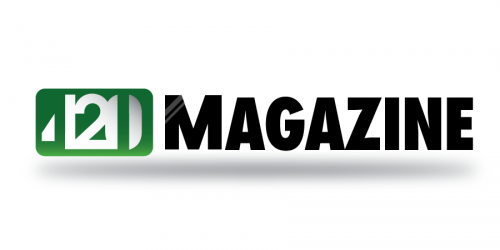
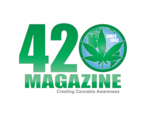
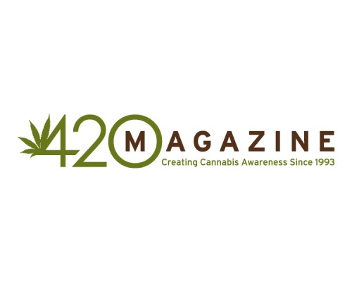
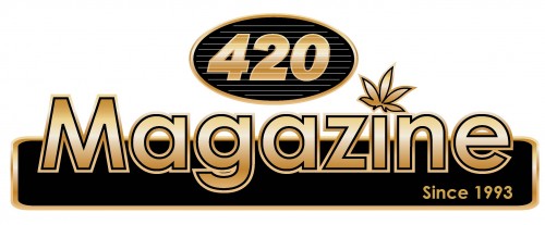
420 Magazine Logo Contest
- Thread starter 420
- Start date
420 Warrior
Well-Known Member
That was on the first post.. First sentence. From 420
my bad, I thought I read that b4 but I forgot where until u reminded me where
I was just thumbing back through all the entries trying to take them all in again in an effort to decide which ones I like best when I remembered something about a printed mag.
The GDP kinda get's to the ole memory sometimes...lol
heh! GDP. Guess what I have in motherhood right now!
RedeyedRasta
New Member
never done this before but thought i would give it a go
")
Sonzor
New Member
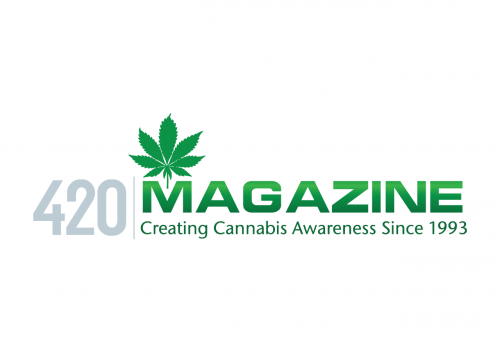
I really like this one. It is very professional, corporate and easy to read. The only concern I might have is how it will cross over to all the different needs you have for it (Website, letterhead, business cards, Magazine Cover, Web Ads. It might be difficult to make this work on all of those but maybe this person has already figured it out. Anyway, enough said very nice job on this one, it is my favorite of the bunch...
snowskate328
New Member
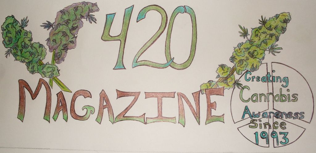
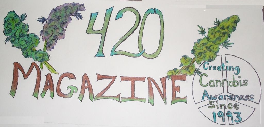
Hand drawn... cannabis inspired
OneLoveAshG
New Member
Giving this another go, saw what 420's designers did and tried to emulate it a little more than my last one, def think I like it better hope u guys do too! <3
snowskate328
New Member
Went back and made the color better... What do you think??
- Thread starter
- #189
420
Founder
Thanks for all your wonderful submissions everyone, we are truly grateful! 
Thought this would be much easier than it is, to choose between so many great designs.
I'll be making an updated post with feedback soon.

Thought this would be much easier than it is, to choose between so many great designs.
I'll be making an updated post with feedback soon.
OneLoveAshG
New Member
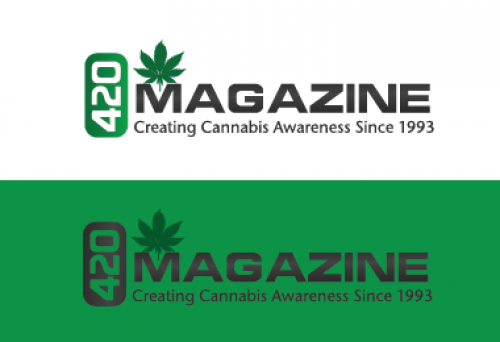
Would love feedback on this one, posted ones with a black, white, and green background!
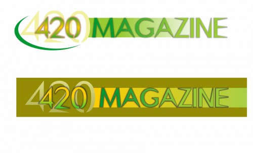
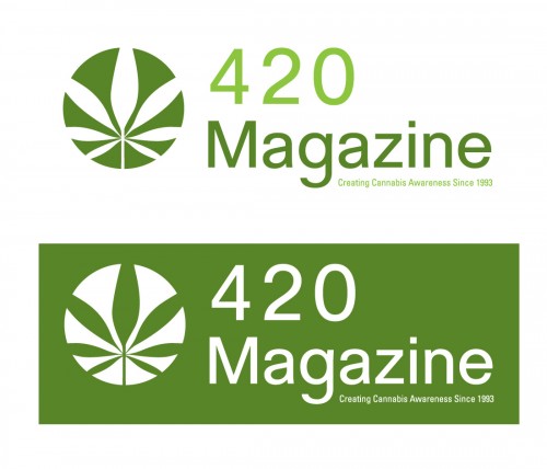
Nice, I really enjoy this logo. Very simple, easy and makes sense.
I would like to see how it looks a bit more squeezed together vertically. Seems a bit long for me personally, other then this I think it's definitely top 3 thus far. Well done sir.
I would like to see how it looks a bit more squeezed together vertically. Seems a bit long for me personally, other then this I think it's definitely top 3 thus far. Well done sir.
OneLoveAshG
New Member
Thanks a lot jj! :] I think you were right about the logo being too long vertically, so I went ahead and fixed it in Photoshop. Def think it looks much better!
420 Girl
Well-Known Member
These are logo contest entries that were submitted by email. Now that we're stuck with the incredibly difficult task of choosing the best logo, we ask for your help in giving us the feedback you can on which one is your favorite and why. The more specific details you give, the better.


420 Girl
Well-Known Member
More contest logo entries submitted by email:


420 Girl
Well-Known Member
More contest logo entries submitted by email:

420 Girl
Well-Known Member
More contest logo entries submitted by email:


- Thread starter
- #197
420
Founder
Nicely done sweetie, thank you! 
Okay guys, as you can see, we have so many great logos, it's hard to choose one to stick with or even one to tweak to perfection. So we need your help by posting the logos you think should win and why. The more specific and detailed, the better, you cannot give us too much information. We've worked almost 20 years getting to this point and need to choose the ONE that will carry us for many years to come.
We are so truly grateful for every single submission, in my opinion, they all rule!
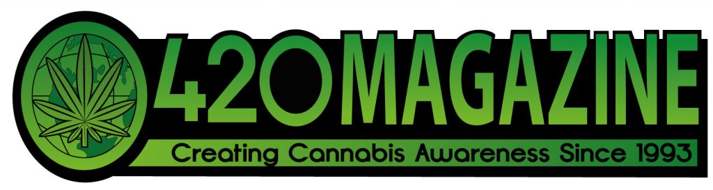
art fog
New Member
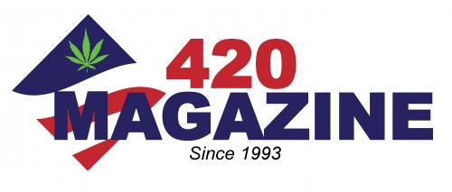
The logo "sun logo" I made w/ the intentions of having 420 viewed w/ serious consideration. This classic design has stately overtones w/ the circular crest and interior alluding to the organic nature of the content via background scape. Instead of organic wheat shafts we have the leaf over plowed fields and mountain vestige.
It has to be tweaked i.e. the colors shifted during transfer while some faded. There are some details that could be added to the crest like the scripting in early copper etchings but for the most part it works best w/ what I understand this competition to be. I can see this logo as a letter head on cotton stationary as well as on a tea shirt anywhere including summer nights at Lincoln Center.
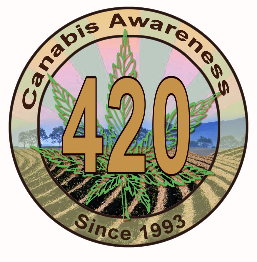
It has to be tweaked i.e. the colors shifted during transfer while some faded. There are some details that could be added to the crest like the scripting in early copper etchings but for the most part it works best w/ what I understand this competition to be. I can see this logo as a letter head on cotton stationary as well as on a tea shirt anywhere including summer nights at Lincoln Center.
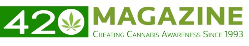
Sonzor
New Member
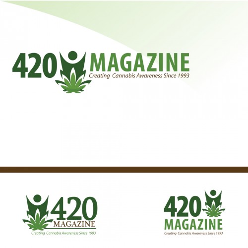
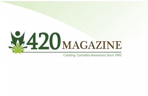
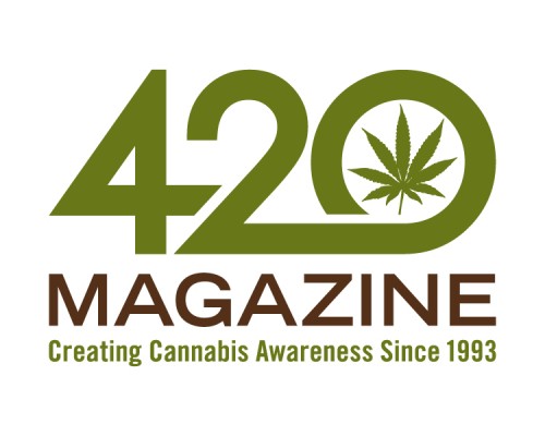
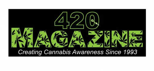
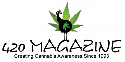
Big fan of this one, clean and should work well for any purpose needed. Nice job. Might want to try, centering the "Creating Cannabis Awareness" and/or spreading it out a bit to balance it out.Another thought might be to even out the sizing of the 420 and Magazine. Just a thought, again very nice...
art fog
New Member
Sonzor, All good suggestions. I will get back to it to center/adjust type, tweak, etc. probably w/in 24hrs. I did get the Mag on it and compensated for some of the lost optimization. There are a few things I want to try also (as always). But this will probably be the last for me for awhile. Thanks for the observations.