

Any idea when we can get some more input from you, 420?
Navigation
Install the app
How to install the app on iOS
How To Use Progressive Web App aka PWA On 420 Magazine Forum
Note: This feature may not be available in some browsers.
More options
You are using an out of date browser. It may not display this or other websites correctly.
You should upgrade or use an alternative browser.
You should upgrade or use an alternative browser.
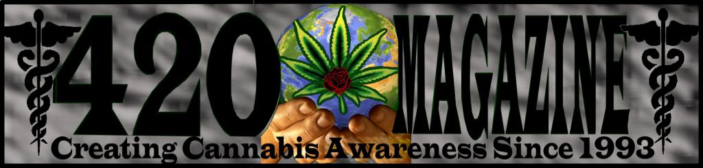
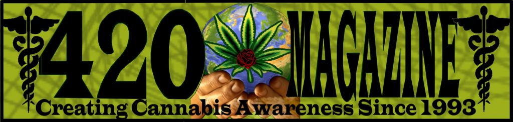
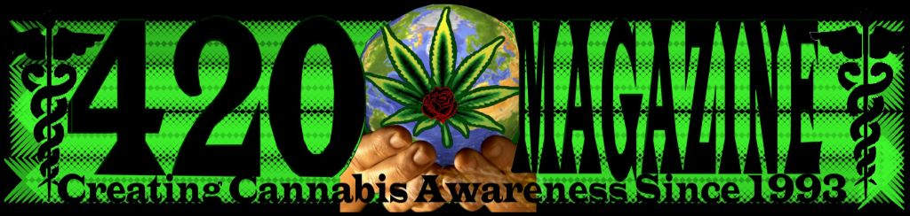
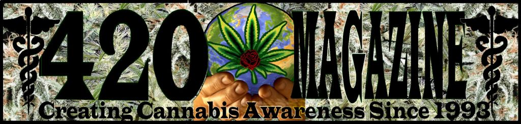
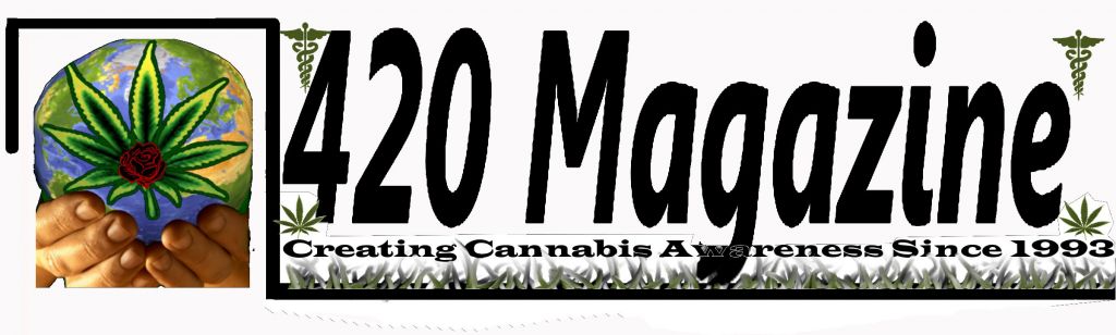
420 Magazine Logo Contest
- Thread starter 420
- Start date
Must-GroNeeds
New Member
Hi all, surely u don't know me. Quite new to the site, post #3 is it? Tho that is bound to change as time goes on. lol I too am curious about an update. I don't know whats still going on with this thread, or not, but i was bored so i threw a few things together. Did just the one design, but gave a few examples of how it could look, one with a blue bud in the background, one with plants, and some others with nearly endless color scheme, border, font, background changes possible so hopefully off of these i can get more direction. There are several minor imperfections in the images. These of course would be fine tuned in the event it becomes necessary. Thanks for the awesome site. Its got me well on my way through planning my grow, and in turn will likely allow me to help other new growers in the future. I plan on doing an in depth grow log with pics when i start up, includeing DIY Cabinet and such. I Digress. Thanks again 
Must-GroNeeds
New Member
Those are nice !!
+ Reps for the new guy !
Hey thanks

After id gotten out all the colorful background in me i had another shot at it in case 420 is looking for something cleaner than my last few. As before there are some minor imperfections disallignments and such but I'm putting these as concepts that can be altered in any way (ie smaller pics removed, dif colors for letters / pics different font, inverted where the pic is on the right not left, ect.) Curious for input from the editor, not necessarily on mine specifically just an updated direction twards the ideal winning template. Is this contest still active or just idling to a stop? Only reason i ask is if more inspiration strikes i'll be jumping on it, tho i seem like I'm out for now lol. Either way i'll be using one of the ones i made in my Signature eventually. Anyways here are the other takes.
Must-GroNeeds
New Member
Ok.. so.. i was wrong lol I came up with more ideas. Sorry for posting so many haha. I just figure id scattershot the ideas and let it be known that i can easily mix and match any of the concepts, backgrounds, fonts, colors, pictures, ect from any of the ones i posted. Also trim can be added to letters and borders to help them show up on dark backgrounds, just alot of work to do that for examples, expecially when doing them by the bucket load as i am lol. and now time for sleep lol Thanks again all. 


RVgrower
New Member
Hey everyone, I'm just putting in my 2 cents, as they say...
I, as a consumer, would really notice and remember what JJ Bones first did in his first set of 6, I believe it was #4 in that set, the one with the EYE! I LOVED that! Out of all the logos, that one, along with the last few designs by Miro, were by far, the ones I would love to see represent the magazine/website/etc.... for 420 mag....All the work is great, and I love that you are asking US to help with the design.... I just thought I'd let you know, 420 Editor, what I, as a consumer, sees and remembers after scrolling thru everyone just now for the first time...
This is still going to be a hard job kind of, because there is so many good submissions, but I'm sure you'll know the design when you see it....I do love that "eye design" by JJ Bones though, can't get that one outta my head, so I think that makes it a really good one!
Good luck, and thanks again!
RVG
- Thread starter
- #146
420
Founder
Sorry for the delay guys, it's hard for me to give feedback on everything here as it would take me hours each time, so I'll only talk about the ones that I believe have potential or at least have less steps for me to explain, to get them to being potential.
The designs I feel might be tweaked to perfection so far, are the following.
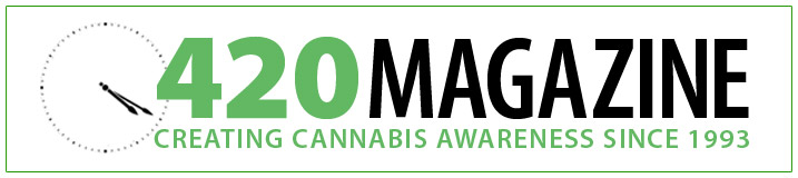
NastyDan - I really like this one, as it looks better than the ones made afterward. My suspicions were correct, adding substance to the clock took away from the name. However it still seems bit too simple and not as imp-actual as I would like. It's still on my list, just keep thinking something better will surface, so I want to be patient and take the extra time to make the right decision.
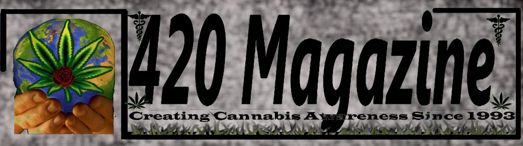
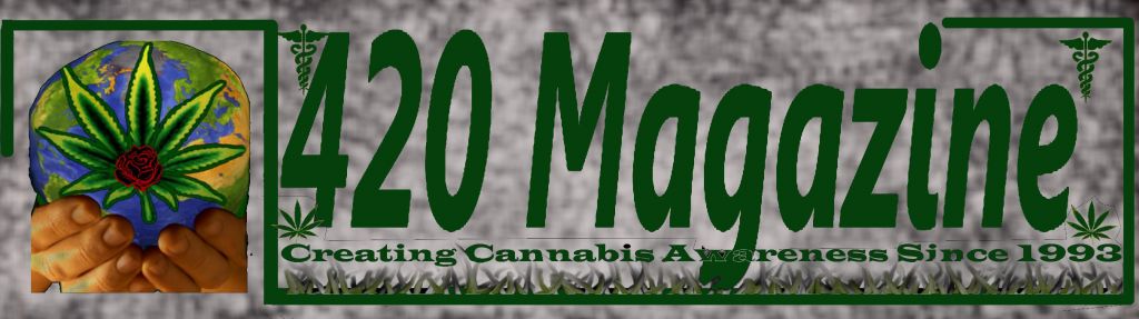
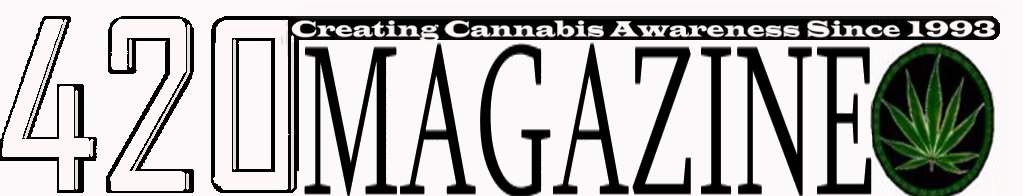
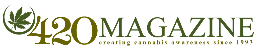
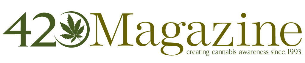
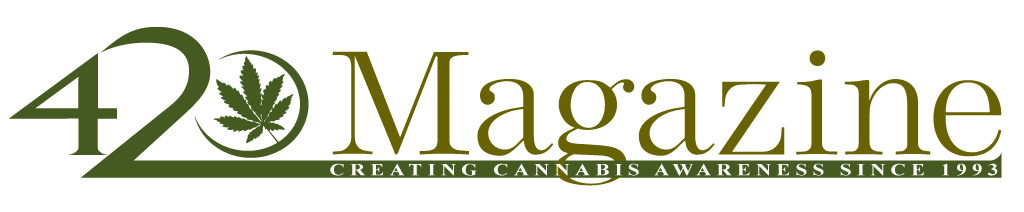
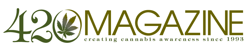
JJ Bones - This one could possibly work, however the text of 420 is not readable enough. You need to be able to take a quick glance at it, then turn away, and still retain the memory of that "420" that you saw. If you are unable to determine what it is at a quick glance, then the text will not be readable enough for proper branding/marketing, in my opinion. Also, please make this on white background instead.
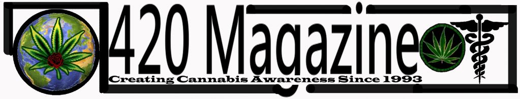
JJ Bones - Same thing applies to this one, however since it has no box around 420, I'd like to see the 420 text be more of a box shape, to give the appearance of a somewhat structural border, in lieu of the box. Also, please make this on white background instead.

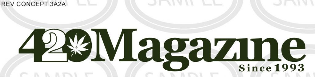
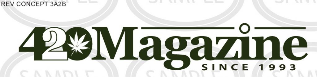
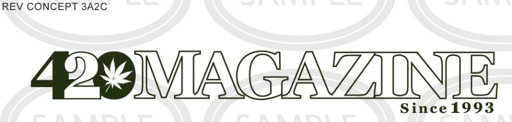
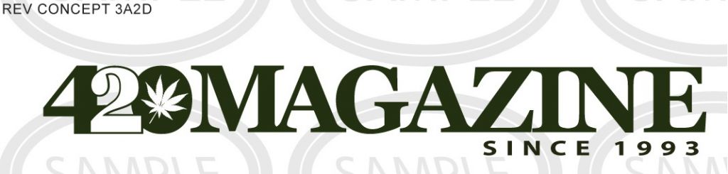
JJ Bones - This one is growing on me, however I'd like to see Since 1993 take up half the height it currently does, yet the same width. Try using a different font that is not so tall, position the slogan text a little closer to Magazine. I'm also interested in seeing this with MAGAZINE in all capital letters. That empty space above the "agazine", to the right of the "M", is not sitting too well with me right now. For some reason the 420 looks a tad bit smaller than Magazine, so make sure the 420 is the dominant one at minimum, however I am thinking keeping them the exact same height will be best.
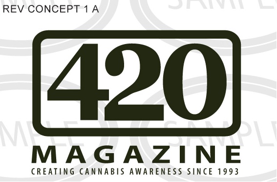
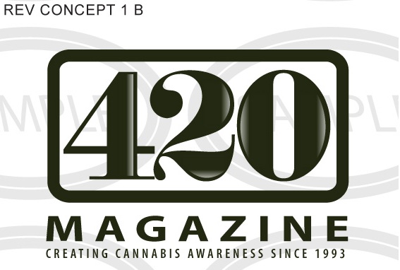
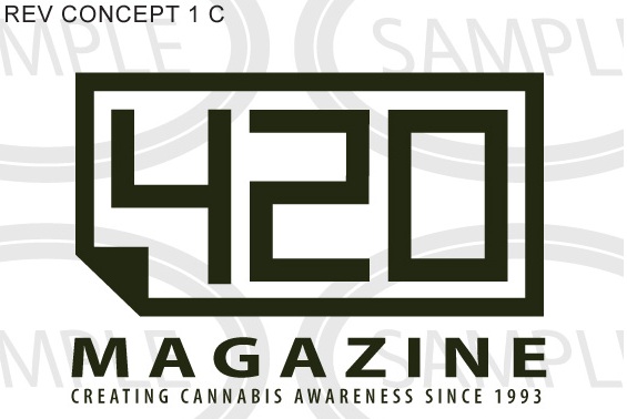
Miro - I like this one, however need to choose a different font for 420 that is less wide, it takes up way too much real estate and that 2 has way too much empty space in it. I would also like to see the hole in the middle of the 4, it's just looking too weird for me at the moment. Please try using some different fonts for 420 and show me.
Miro - I really like this one, it may just be the simplest, classiest one so far, however I'm not 420% sold on the font of 420. Everything else seems perfect, however would like to see some more options of different text for 420. I love the structure, seems very simple, elegant and in your face, everything is very readable at a quick glance. I could see this across the top of a classy magazine. Could it be too classy for 420 Magazine? Still thinking.
Miro - This one is very interesting and has great potential, however the 420 must be more readable, please try using some other fonts that show 420 plain and simple. The more artsy you get with the letters, the less easy it is for people to understand what it says and retain the information for later. Leave everything else as is.

Sonzor - I like what you are doing with the structure in these, however I think the problem is the effects you are using to accomplish an artsy look and feel. Many of them look like too much, like amateur fonts used for yard sale signs or lost cat posters, not for a branded logo. Please try to simplify and use less effects. Imagine Tammy Faye Baker toning down her makeup.")
Sonzor - You're on the right track on this one, simplifying the text, however then you went too far with the 420 text art, that we can’t read the 420 easily now. I do however like how the line goes under the text, across the logo. Simplify all of your text and you will be closer to what I am seeking.
I would like to remind everyone that we are seeking a simplified logo, if there is too much going on it it, they won't be considered, however are greatly appreciated as they are all great works of art and we are truly grateful.
The designs I feel might be tweaked to perfection so far, are the following.
NastyDan - I really like this one, as it looks better than the ones made afterward. My suspicions were correct, adding substance to the clock took away from the name. However it still seems bit too simple and not as imp-actual as I would like. It's still on my list, just keep thinking something better will surface, so I want to be patient and take the extra time to make the right decision.
JJ Bones - This one could possibly work, however the text of 420 is not readable enough. You need to be able to take a quick glance at it, then turn away, and still retain the memory of that "420" that you saw. If you are unable to determine what it is at a quick glance, then the text will not be readable enough for proper branding/marketing, in my opinion. Also, please make this on white background instead.
JJ Bones - Same thing applies to this one, however since it has no box around 420, I'd like to see the 420 text be more of a box shape, to give the appearance of a somewhat structural border, in lieu of the box. Also, please make this on white background instead.
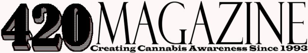
JJ Bones - This one is growing on me, however I'd like to see Since 1993 take up half the height it currently does, yet the same width. Try using a different font that is not so tall, position the slogan text a little closer to Magazine. I'm also interested in seeing this with MAGAZINE in all capital letters. That empty space above the "agazine", to the right of the "M", is not sitting too well with me right now. For some reason the 420 looks a tad bit smaller than Magazine, so make sure the 420 is the dominant one at minimum, however I am thinking keeping them the exact same height will be best.
Miro - I like this one, however need to choose a different font for 420 that is less wide, it takes up way too much real estate and that 2 has way too much empty space in it. I would also like to see the hole in the middle of the 4, it's just looking too weird for me at the moment. Please try using some different fonts for 420 and show me.
Miro - I really like this one, it may just be the simplest, classiest one so far, however I'm not 420% sold on the font of 420. Everything else seems perfect, however would like to see some more options of different text for 420. I love the structure, seems very simple, elegant and in your face, everything is very readable at a quick glance. I could see this across the top of a classy magazine. Could it be too classy for 420 Magazine? Still thinking.
Miro - This one is very interesting and has great potential, however the 420 must be more readable, please try using some other fonts that show 420 plain and simple. The more artsy you get with the letters, the less easy it is for people to understand what it says and retain the information for later. Leave everything else as is.
Sonzor - I like what you are doing with the structure in these, however I think the problem is the effects you are using to accomplish an artsy look and feel. Many of them look like too much, like amateur fonts used for yard sale signs or lost cat posters, not for a branded logo. Please try to simplify and use less effects. Imagine Tammy Faye Baker toning down her makeup.
Sonzor - You're on the right track on this one, simplifying the text, however then you went too far with the 420 text art, that we can’t read the 420 easily now. I do however like how the line goes under the text, across the logo. Simplify all of your text and you will be closer to what I am seeking.
I would like to remind everyone that we are seeking a simplified logo, if there is too much going on it it, they won't be considered, however are greatly appreciated as they are all great works of art and we are truly grateful.
budbro
New Member
Just my .02 worth on whether it can be too classy for 420? I don't think so if the goal is to get new readers and sway them to actually stop and read something intelligent here. Which they will!
We will all be here no matter what you choose and the peeps wanting to learn about growing will still end up here because of the experience of the members and education one can receive. But, to the naysayers and those with a "holier than thou" view of cannabis, they might stop and take a second look at something that looks polished or corporate and learn something while they are here.
We will all be here no matter what you choose and the peeps wanting to learn about growing will still end up here because of the experience of the members and education one can receive. But, to the naysayers and those with a "holier than thou" view of cannabis, they might stop and take a second look at something that looks polished or corporate and learn something while they are here.
Sonzor
New Member

Sonzor
New Member
Sonzor
New Member
Sonzor
New Member
kikuras
New Member
I must say, I have thoroughly enjoyed looking through this thread! There have been many postings that look amazing. I cant quite remember all the ones I liked (cause there were so many) but I really enjoyed JJ Bones first attempts, they looked really sharp, clean, memorable, and professional. Keep up the good work everyone and I cant wait to see the winner, I'm sure it will be unbelievable. Will members be allowed to chose/vote for the best one? I think that would be a good way to get even more community involvement and really have people wear the winning shirt with pride...I know I'm excited to order mine!!
Must-GroNeeds
New Member
so I'll only talk about the ones that I believe have potential or at least have less steps for me to explain, to get them to being potential.
The designs I feel might be tweaked to perfection so far, are the following.
Hey 420, thanks for the update. I really appreciate everything this site stands for and I'm sure this isn't the only thing you have to attend to. Surely i speak for most participants here in saying we do appreciate the little tweaks of advice to start us in the direction that you're going for. On that note i tried hashing together a few more ideas that might be more geared in the direction you're looking for than my previous entries. Probably not the "something better" poping up but lookin forward to you're next update, these things are keeping me busy as i plan my grow lol


The last few are my favorite lol particularly the very last
__________________________________________________________________________
__________________________________________________________________________
__________________________________________________________________________
__________________________________________________________________________
__________________________________________________________________________
__________________________________________________________________________
Sonzor
New Member
ideas without typo...

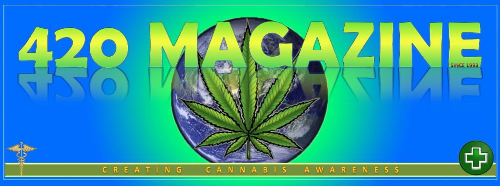
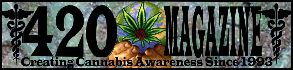
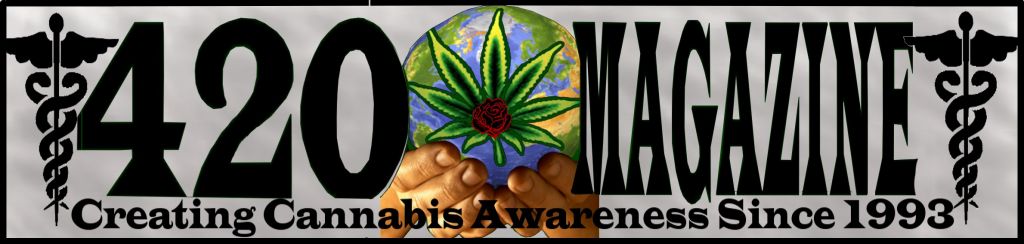
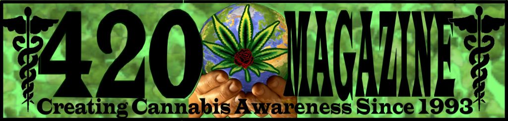
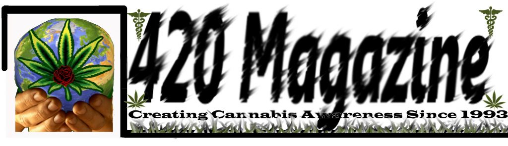
This is image I thought would be good as a back patch on T-Shirts
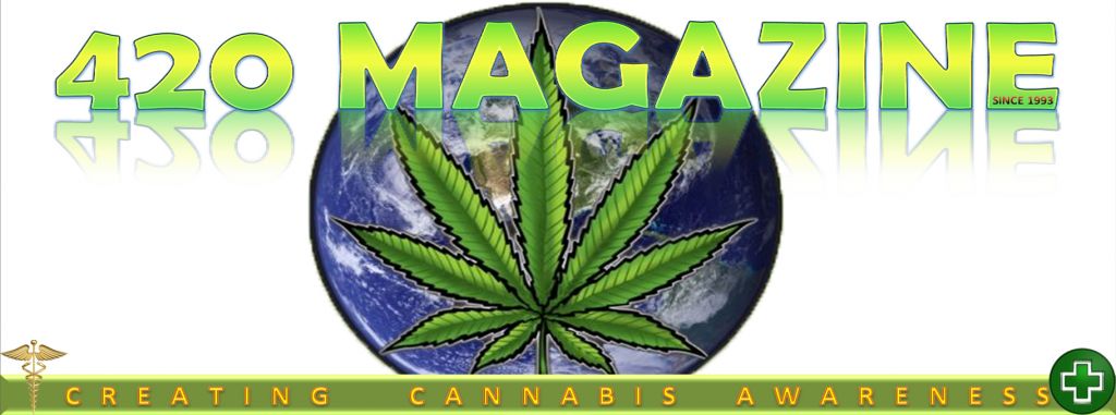
This image I thought would be good as Transparent Overlay on print Magazines

This is an example of the transparent overlay for a magazine
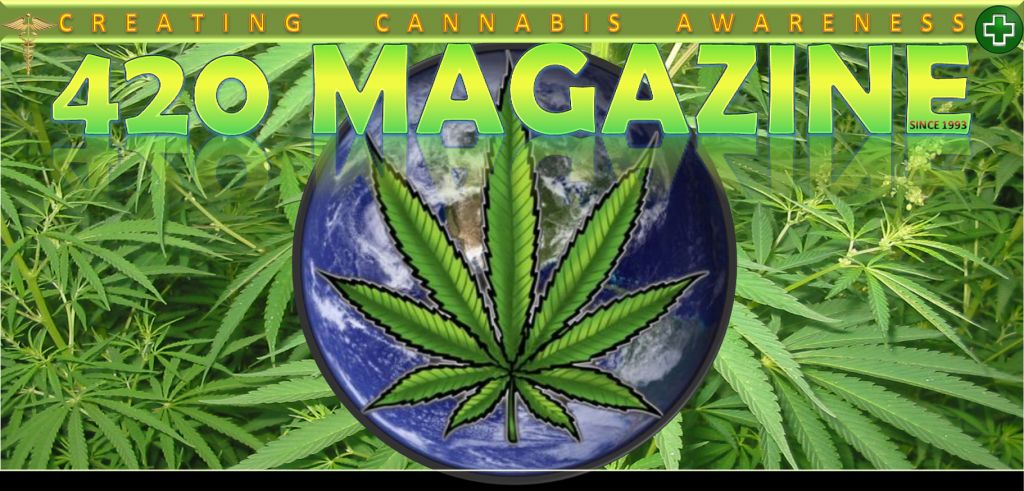
Magazine Overlay Variant